Tambor y Caracol
OVERVIEW
Handcrafted for Culture and Connection
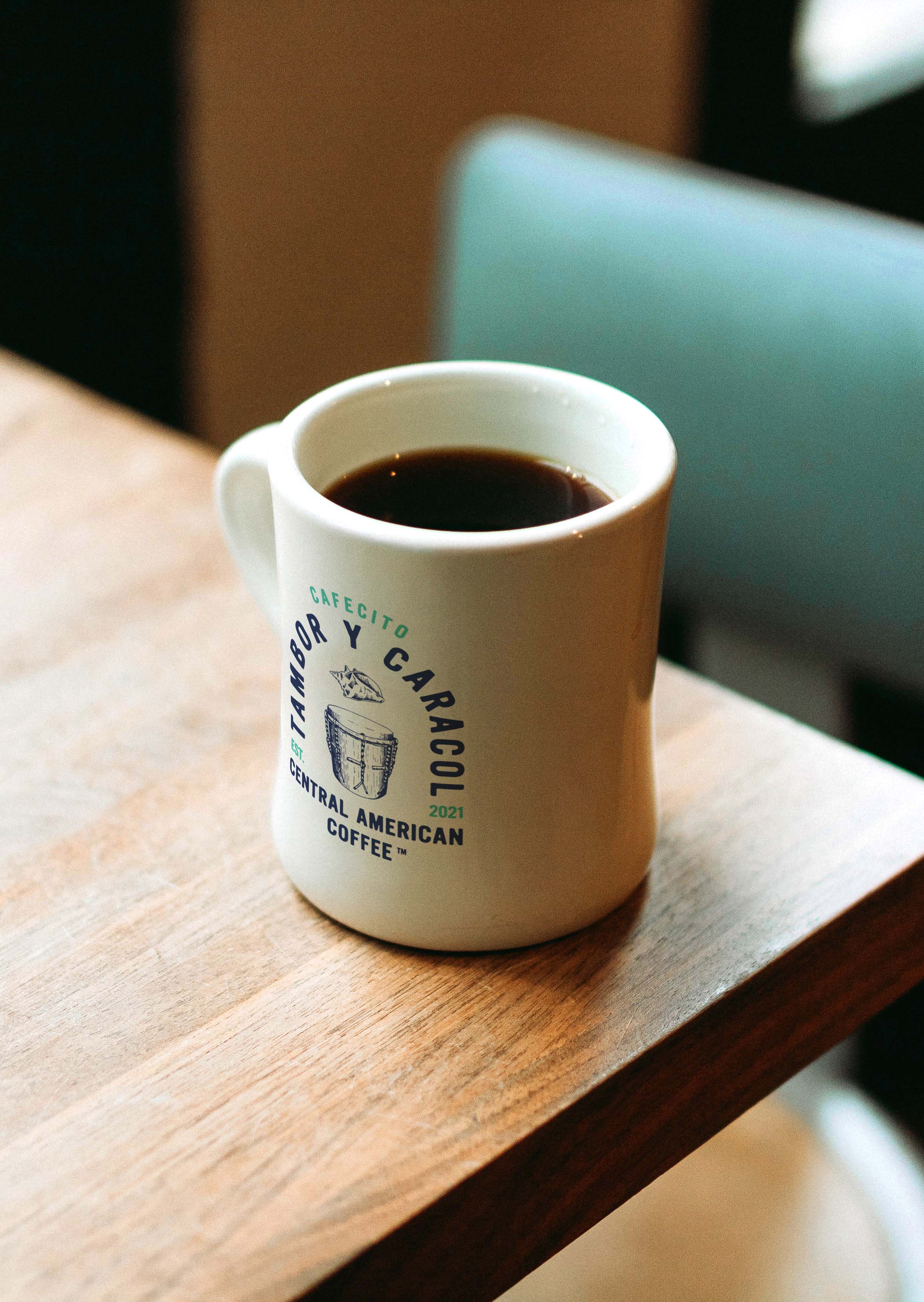
Cafecito Tambor y Caracol (CTC) approached me to create a logo and brand identity for their new coffee company. Named after the tambor (drum) and caracol (conch) used in Punta music, a genre born in Honduras, the brand needed to reflect heritage, culture, and community. CTC isn’t for coffee elitists with expensive machines. It’s for the families who start their mornings together over pan dulce, conversation, and a good cup of coffee. It’s for those who take pride in supporting Central American farmers and local roasters while celebrating culture at the same time.
.jpg)
STRATEGY
Grounded for Growth
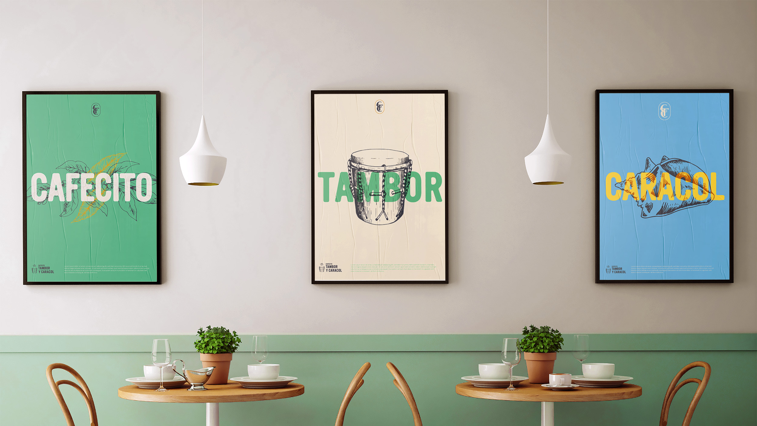
Our strategy was to design a visual identity that celebrated the cultural roots of CTC while also preparing the brand for long-term growth. The identity needed to carry the vibrancy of Honduras through color and imagery, highlight the instruments that inspired the name, and communicate authenticity in every detail. At the same time, the system needed flexibility to expand into new roasts, packaging, and future collaborations. By combining hand-drawn elements with a structured badge mark, we created a foundation that feels grassroots yet scalable.
KEY INSIGHT
Most coffee brands source Central American beans for their bold flavors and unique profiles. Few, however, center their identity on supporting local farmers and preserving cultural heritage. CTC stood apart by prioritizing both the coffee itself and the people and traditions behind it.
SOLUTION
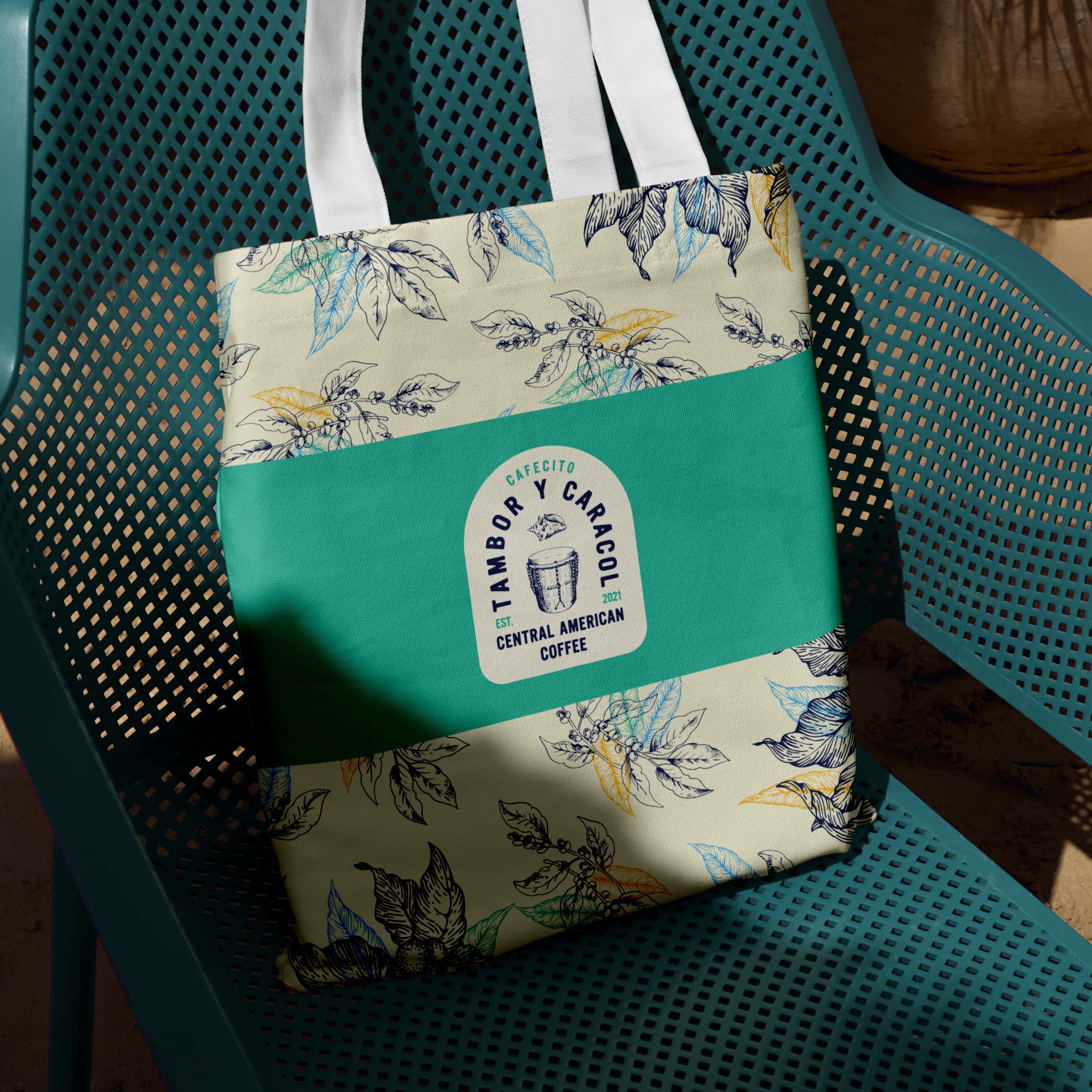
To bring the brand to life, I developed an identity system that honored Central American culture while remaining flexible enough to grow with future roasts. The logo became a badge that gave equal weight to the tambor and caracol, while keeping the brand name legible and bold. Hand-drawn coffee plant illustrations paired with the mark to create a grassroots feel, reinforcing the brand’s approachable and community-driven spirit. The color palette, inspired by Honduras, balanced warm and cool tones to reflect vibrancy, diversity, and warmth. Together, these elements created a brand that feels seasoned, approachable, and deeply connected to culture and tradition.
.jpg)
.jpg)

OUTCOME
Culture in Every Cup
The final identity harmonized all the elements that make CTC unique—coffee, culture, music, and community. By combining handcrafted design with a vibrant palette, the brand embodies its mission of celebrating culture while supporting farmers and families. CTC now has a bold, flexible system that can grow with its product line while staying true to its roots.
OVERVIEW
Handcrafted for Culture and Connection
Cafecito Tambor y Caracol (CTC) approached me to create a logo and brand identity for their new coffee company. Named after the tambor (drum) and caracol (conch) used in Punta music, a genre born in Honduras, the brand needed to reflect heritage, culture, and community. CTC isn’t for coffee elitists with expensive machines. It’s for the families who start their mornings together over pan dulce, conversation, and a good cup of coffee. It’s for those who take pride in supporting Central American farmers and local roasters while celebrating culture at the same time.